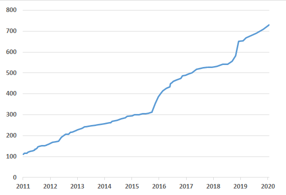
We regularly update the history of PVS-Studio's new features and improvements at the product website. But the text format isn't very informative in visualizing the development intensity. That's why we decided to write a small post and include a more informative diagnostic count graph.

We already published a similar post, "PVS-Studio graph of diagnostic abilities development", about a year ago. But since the updated graph looks so nice, why not publish it one more time? :)
Of course, new diagnostics aren't the only new feature being added to our product. For instance, we work a lot on integrating PVS-Studio with various systems such as Azure DevOps, Travis CI, CircleCI, GitLab CI/CD, Jenkins, SonarQube, and so on. It's just that the graph is the best form for visualizing the rapid development tendency.

This graph shows the number of diagnostics added to PVS-Studio over time. Detailed information about new features can be found in the "Version History" section.
So far we've managed to maintain quite a rapid and steady growth, which also makes us a force of progress by stimulating other tools to keep pace :).
Thanks for reading. If you'd like to take a look at figures rather than graphs, welcome to "PVS-Studio ROI" :).
0