
Our website uses cookies to enhance your browsing experience.

The PVS-Studio website turns 15 this year. This is quite significant for any internet resource. Back then, when our website was born, Russia announced 2006 as a year of humanities. That same year, in June, Denis Kryuchkov established a new platform, "Habrhabr" (now known as Habr). In November, Microsoft officially completed OS Windows Vista. That same month we registered the viva64.com domain.
We celebrated our domain's 10th anniversary with the website's redesign. After that, we would only change the resource capacity and features, but we'd never touch the design in any way. During this time, the number of articles grew so much that we needed to add tags to facilitate navigation. Right now we are also working on our YouTube channel. This means, you will see more and more new videos on our website as well. We keep adding new web pages at a tremendous rate, while the website's usability stays the same.
Time has come for big changes!
The first thing to understand about any global changes is why do them and whether they are needed at all. That's exactly where we started. We'd been playing around with the redesign idea for a while. And here's why:
1. People kept commenting our articles. In their comments, they were genuinely surprised that we provided a trial key. And that they could request one. And that they could easily do it on our website.
2. Sometimes we'd get questions about where to view "What's new" notes for the latest release.
We are still getting questions about the Linux version. Although, to be honest, there are fewer questions now.
3. Webvisor showed us all the challenges a client had to face on our download page.
4. In general, something was telling us that the long text describing the product was too long and complicated (your feedback demonstrated that, of course).
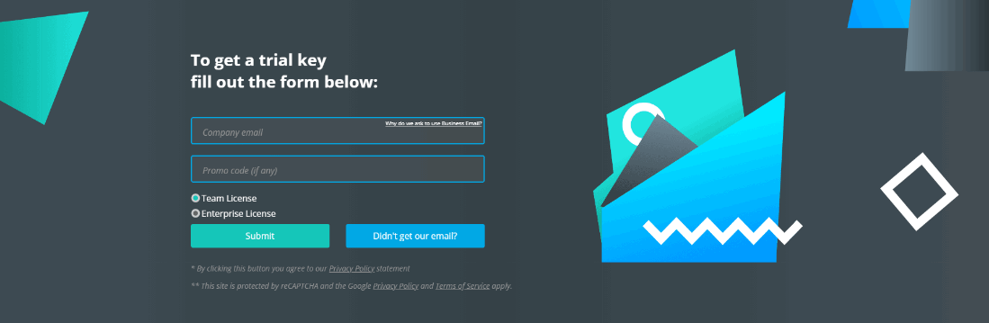
5. We also experienced difficulties with advertising and landing pages for it. The trial key request process was not intuitive. A client first had open the download page, then scroll it down, find the form, fill it in (choose a platform, trial version, email, first name, last name), add a comment (we've made this field optional only recently!)...).
We used that feedback and information as a foundation when prototyping our new website.
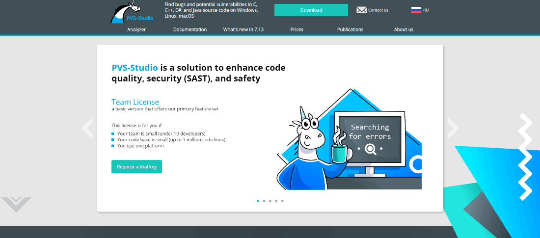
Prototyping any resource starts with a goal. Information resources encourage their users to return and aim to keep them on the website longer. The goal for an online store is a purchase. In our case (a product website), the goal is a request of a trial key and price. A lead, to be precise.
Statistics show that users usually look at 3-4 pages before requesting a trial version. They would read some articles, open the product page, study various kinds of licenses, find out about where they can integrate the analyzer, and only after this some of them would download the distribution and request a trial.
So here's what we came to:
1. The trial request form must be on every page, and it should be simpler. Even simpler than that! Very simple!

2. Similarly, users must have direct access to downloading the distribution on every page.
3. We must provide different ways to download the distribution. If the first option does not work for someone, the second one might.
4. Our clients should see at once that the analyzer is available for three platforms. By all costs we need to avoid the scenario when somebody misses the fact that PVS-Studio is available for Linux and macOS.
5. We must list the product's advantages clearly and concisely.
6. The website's main pages must answer our client's main questions.
7. Our blog and documentation must be in their own separate sections, so that working with them would be as convenient as possible. While browsing those, our users must not lose track of the product page.
So what did we come up with?
1. We reduced the trial form to a few fields and showed it one the website's every page.
2. We added the "Download" button to the header and pinned the header so that it's always visible when a user scrolls the page.
3. We created different download forms to show on the product and download page.
4. We specified steps to select and download the distribution. Choosing a platform (Windows, Linux, macOS) became the first step.
5. We identified and briefly stated the PVS-Studio static analyzer's 10 main advantages and made them into an interactive list.
6. We specified which goals each page needed to achieve. Then we broke them down into blocks that helped meet these goals.
7. We created separate templates for publications and documentation. However, we used the same theme and the same domain.
You get what you give - or, in our case, you get what you design. Indeed, design matters. A lot. It affects whether your users remember the resource. Whether they find all the elements you need them to find. Whether they click the "x" button after the website loads...
This is why we were ready to put in a lot of resources and effort into designing our website. We found a freelance designer with a decent portfolio. It did not matter that he was far away from us (in another city). We waited two weeks for our contracts to travel back and forth via snail mail. Then we waited two more weeks while the designer developed his version of our front page. Finally it was done. And all that waiting - it was all for nothing. What we got was nothing like what we wanted.
As they say: vague goals - vague result. We learned from our mistakes and detailed all changes we wanted to see in our front page's project. Bullet point by bullet point. With examples. I guess it was a little too much. Here's the reply we got:
So, a month had passed, and we had no designer.

Looking for a new one, spending time to sign contracts, hoping that this one won't quit on us - we did not want to take that road again. Not anymore. So we looked at a different road and got some help from a front-end web developer (spoiler).
We started with dropping by our staff designer Galina's office. Wondering why we didn't start with her? Well, that's because Galina is always working on other tasks we entrust her with. She draws, animates, prints, processes, invents... That's quite a bit for one person!
However, Galina did not say "no" and accepted that long list of our requirements:
If you think this is detailed, do not be mistaken, the actual specification was truly exhaustive.
So Galina got to work. Unicorns, geometry, all elements highlighted. The gaze is directed to all the right places.
Did you think our troubles with freelancers were over? That's not quite so. Now we had to look for a freelance front-end web developer, since we only had a back-end developer on our staff. We found a front-end web developer, signed a contract, sent him our specification, prototype and mock-up. Then we sat down and waited.

Two weeks passed, so we asked him to show us something. Got a response that it was too early. So we kept waiting.
A month had pased, we needed to see some result. But we just kept getting promises. One more week. We became more persistent - only to find out that the developer has a difficult personal situation. We empathized and canceled. That's when we understood that we wasted over a month - the work was not done and we did not have a front-end web developer anymore.
Did we go to see our staff developer? Sadly, no. A back-end developer is a back-end developer. So we had to look for a new front-end web developer. The Universe's proving grounds must have run out of obstacles, and we found a new front-end web developer quickly. We started our collaboration.
The frontender's first step was an attempt to sell us Next.js. We almost agreed. The pages loaded amazingly quickly. The SEO problem was easy to solve (search engines got HTML thanks to SPA). We pondered a bit, and hit an insurmountable obstacle: who's going to maintain all this beauty? So we went back to the good old HTML+CSS+JS.
The new layout required serious changes to the website engine. Fortunately, our staff back-end developer is a part-time wizard. That's why he took the layout and reassembled the website's engine from scratch, block by block. Although this might sound pretty easy, it took a lot of effort.
Along with introducing the new design, we wanted to switch to a new domain. A domain whose name does not sound strange. If only you knew how often we had to explain why our website's name is viva64!
Changing the domain seemed easy: create a new website on a new domain, redirect users from viva64.com to pvs-studio.com. Done!
Well... not quite. Search engines just had to interfere with our plan. When a website's design and a website's domain change simultaneously, search engines logically see it as a new website. It takes new websites a long time to get to the top of search results. So we had to postpone the design change. Changing the domain became our first step. We sent a request to search engines and got their blessing. Only then did we present our redesigned pvs-studio.com website.
Although there's still much work to do, our website's first implementation is ready to welcome its first guests. As for us, we are ready for your comments: what you liked, what you would like us to improve. We know, there's no limit to perfection!
0
0
0
0