
Our website uses cookies to enhance your browsing experience.


We have updated the graphical user interface in the recently released version of PVS-Studio 6.10 of Visual Studio plugins and Standalone version. The previous version of the interface existed for almost 6 years without any significant changes since PVS-Studio 4.0, released in 2010, in spite of continuous evolution (menu items and buttons were regularly added and removed).
In this article we want to tell, what reasons prompted us to start thinking over the need to change the interface, and what challenges we faced in the process of working on it.

A little bit of history. A separate PVS-Studio window first appeared in Visual Studio plugin in the 4th version of the analyzer. The previous versions used a standard Error List window for displaying diagnostic messages, but our demands quickly outgrew it. Besides the inability to add custom filters, context menus, buttons and so on, the main reason prompting us to create our own window for PVS-Studio messages was the Error List performance. It was impossible to work with it when the number of messages was reaching several thousands - Studio was hanging from just trying to scroll its contents.
Of course, one may say that an analyzer issuing thousands of warnings is a bad analyzer. However, it should be borne in mind that our first diagnostics were errors of porting C++ programs to a 64-bit platform and, by their nature, they can be very numerous, especially on really large projects. We can even tell (it's our small secret) that our "anti-record" was a report containing about 250 000 messages! But I want to calm down our present-day users - the current version of PVS-Studio does not behave like that anymore, especially that now we have such concepts as "severity levels" of errors and various methods for mass suppression or disabling false positives (which will inevitably happen in the scope of static analysis methodology). However, in 2010 there was nothing like that and the "lags" of the interface were really relevant.
The first versions of our plugin with a separate window supported Visual Studio versions 2005 and 2008. It should be noted that modern Visual Studio is continuously improving; the problem with the display of a large number of messages in a standard Error List is probably not so relevant anymore, but the advantages of a separate "output window" are still evident. It's quite amusing to draw a parallel with a C++ analyzer that is built into Visual Studio - in a certain period (I suppose these were 2010-2012 versions, but I may be mistaken), this analyzer also used its "own" window to display its results. However, in the latest versions, Visual Studio went back to displaying the results in a standard Error List window. I will speak later about the reasons of why, in our opinion, the developers of Visual Studio did it.
As I mentioned above, the first versions of PVS-Studio window were made for 2005 and 2008 versions of Visual Studio environment. Thus, when developing the original design of our window, we focused on the design of a standard Error List from these versions of IDE. This mainly explains the style of the icons that we made at that time. Despite the fact that in modern versions of Visual Studio, our window supported all trendy new color themes, the icons remained the same since those times. Here is how the main components of our interface looked like before the "facelift":
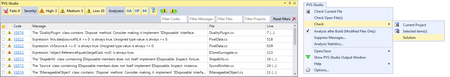
Figure 1 - old PVS-Studio interface in Visual Studio 2015 (the output window and the main menu)
Which problems did our interface have beside purely "esthetical" ones? Perhaps, our main problem, or rather a problem of our users, is the intuitiveness of the interface. Even such seemingly basic functionality as markup of false positives through the context menu, or the differentiation of messages according to their severity level, were often non-obvious to our users, and caused a lot of questions. Often there were cases when a user thought the warnings of the 3rd level to be the most dangerous ones. Another problem is the "bulkiness" - there are too many labels, unknown acronyms and buttons, so it's hard to find what is needed.
We tried to solve these problems in the new interface, but how successful was this venture - you will find out later.
Before we started writing the code, we contacted a professional designer with a task to create a concept for the new interface. As I mentioned earlier, our window repeated the concept of a standard Error List, and thus, the central part of it was the classic "grid" - a table with columns and rows. We wanted to experiment and try to abandon the "classic" formula, especially that minimalism is being trendy at the moment, and the Visual Studio itself tries to keep these trends in its interface. As a new "inspiration" we decided to use Visual Studio items again - notification window and an output window of an embedded C++ analyzer.
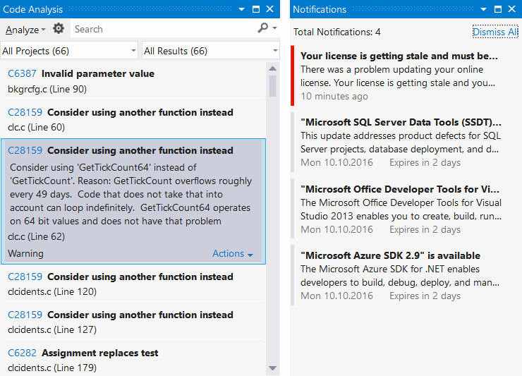
Figure 2 - window of the embedded static analysis (Visual Static 2012) and the notification window (Visual Studio 2013).
As you can see from the pictures, both are minimalist to its maximum - they contain nothing except the message text and some identifier (code or a color marker). There are also fields for searching/filtering on the left window. Also, in contrast to the Error List, both windows are oriented to the vertical, rather than horizontal, position.
And here I want to go back to what I mentioned above - for some reason, in Visual Studio 2015, Microsoft developers abandoned their "fashionable" new vertical static analysis window (picture in the left) in favor of a "good old one" Error List. Why did they do so? To my mind, and judging by the experience of using this new window - it was done simply because this window was very inconvenient to use. Very few messages fit into the vertical table and there was no possibility to sort them by some criterion (for example, by the code or the file); when opening the card with the message, it sometimes took up the whole screen.
Having "played" with various variants of design, we have come to the same conclusion - the analyzer warnings (as well as the compiler warnings, for example) are more convenient to view and analyze in the classic horizontal "grid". Yes, the notification interface is comfortable (it is on the picture to the right), when it is necessary to issue two-three messages that require attention, but when a user needs to work with dozens (and sometimes with even thousands) of messages - the benefits of tables become really obvious. Of course, after the initial setup, the developers usually have to deal with several messages on the new code - if the analyzer is used properly, i.e. regularly. But the initial set-up phase is equally important, and often the success of the further use of the analyzer depends on the correctness of its implementation. However, we've gained an interesting idea from the notifications window for the differentiation of warnings according to the "severity" level - by using colour strips.
Once we had determined the general direction, it was necessary to choose the technological basis for the interface. The previous version of our interface used the "good old" Windows Forms framework - this was due to the need to support Visual Studio 2005 and 2008. Taking into account the fact that the Visual Studio plugin is developed in C# and that Visual Studio is not a cross-platform application and, the most important thing, is that the Visual Studio uses WPF for its own components, the most logical decision seemed to use the same WPF for our updated interface. Nevertheless, even despite the fact that the inner logic of plugin and the data structures it uses aren't directly "connected" with the interface, we decided to make some "redecoration" in the current version, that is, simply to "repaint" the current interface according with the updated design, leaving all underlying components unchanged. Unfortunately, the real world dictates its own conditions, and sometimes you have to prioritize what you want to do, and what needs to be done. More so, that this small touchup can be done involving not so much effort and in quite a short period of time.
We have to acknowledge that we already feel WinForms limitations - even such a seemingly small "cosmetic" edit demanded several more "kludges" - not noticeable for the end-users, but hampering the further support and development of the interface. For example, we had to fiddle with new buttons of levels (the ones with the color stripe), displayed on the toolstrip panel. A standard WinForms toolstrip is responsible for rendering its own elements, but when hosting a custom user control, rendering this control falls onto itself (this was especially true for us in terms of Visual Studio color theme support). Using WinForms also makes us use fairly archaic VS SDK interface GetVSSysColorEx to support color themes, and to manually paint our components, as well as to detect the moment of switching the currently active color theme. For WPF Visual Studio offers a more convenient mechanism for acquiring colors through dynamic resources, directly in XAML markup.
In the end, I think we can state with a high degree of certainty that the next (after the current upgrade) version of PVS-Studio interface will be completely based on WPF. Now, our goal, is maintaining the "authenticity" in relation to the standard Visual Studio windows as it was in the previous iteration of the interface. You can see the final result below:
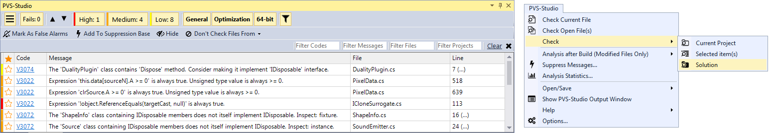
Figure 3 - updated PVS-Studio interface, (the output window and the main menu)
Old icons of PVS-Studio plug-in were far from ideal or, to be more exact, from the standard "themes" in Visual Studio, so we decided to replace them. The basic requirement for new icons was their conformity to a single style and good contrast for all Visual Studio color schemes.
Once we have decided upon the set of icons, we started the development. The first problem that we encountered was, oddly enough, displaying icons in the main menu of Visual Studio. You may say: - "Wait, you have already showed your icons in the menu since the first version of PVS-Studio!" Indeed, it is so, however, the previous method was not suitable for our purposes. I should clarify that for setting the icons we used a single Visual Studio extensions mechanism for creation of menu items - vsct files (more details here) What didn't suit us in this option? First of all, the icons could be set only once - when the plugin is loaded by VS. What we wanted was to imitate the behavior of standard VS icons, i.e. change the color depending on the selected color scheme (as it turned out later, this requirement was unnecessary - VS knows how to do it itself). Secondly, the vsct file cannot (or perhaps we don't know how do it within the scope of vsct file) use alpha channel in the image of icons, making them look very unattractively.
We had a question - how can we program an icon image for the menu item, is it even possible in general? After a long search we managed to find a third-party Visual Studio extension that was able to do it. And studying its source code allowed us to find the answer to this question- it all turned out to be extremely simple:
var commandBars = (CommandBars)DTE.CommandBars;
var menuBar = commandBars[menuBarKey];
var pvsBar = menuBar.Controls["PVS-Studio"]
    as CommandBarPopup;
...
cmdBtnControl.Picture = ImageHelper.BitmapToStdPicture(bmp);
We also had a concern that this method may "break" if the user would want to (and why not?) rename the menu item 'PVS-Studio' - Visual Studio indeed makes it possible to do this. However, these fears have proved to be in vain - the internal names of commandBar objects can not be changed.
Having solved the issue with the dynamic icon display, we have implemented an algorithm, by which a monochrome icon would be painted with the color selected from the active color scheme of Visual Studio. We inverted all the resource icons into white and wrote a simple converting algorithm that multiplies the color value of every image pixel by the one we need:
public static void Colorize(ref Bitmap img, Color color)
{
  for (int x = 0; x < img.Width; x++)
  {
    for (int y = 0; y < img.Height; y++)
    {
      // Traverse every image pixel image in the loop
      // Multiply its color by the text color in the
      // current color scheme
      var pixel = img.GetPixel(x, y);
      var r = (byte)(((float)pixel.R) * ((float)color.R / 255f));
      var g = (byte)(((float)pixel.G) * ((float)color.G / 255f));
      var b = (byte)(((float)pixel.B) * ((float)color.B / 255f));
      img.SetPixel(x, y, Color.FromArgb(pixel.A, r, g, b));
    }
  }
}
Finally we got this result:

Figure 4 - Example of the icon colorization algorithm.
However, we detected a surprising behavior - in case you select for example, "red" color scheme for VS, the icon is displayed correctly. In the "light" scheme it was also displayed correctly. However, in "dark" scheme, the icons remained black, and didn't become white as we expected. It turned out that the Studio knows how to invert certain colors of a picture depending on the "brightness" of the background in the chosen color scheme - thus, our previous experiments with colorizing icons were in vain. Studio has done everything for us. Despite this, we still decided to keep the programmed method of setting the icons because of the problems with an alpha channel.
Similarly, in our output window of PVS-Studio we have replaced all the badges and icons with the similar ones from the set. However, while the menu icons changed their color depending on the chosen color scheme in VS automatically, the icons in the plug-in window remained in the original form for all the color schemes.
Figure 5-Problems with displaying icons in a dark color scheme of Visual Studio.
We started thinking over the question if we can use Visual Studio SDK to use its own algorithm of the colorization for our icons. The result didn't make us think long. In several minutes we came across the method GetThemedBitmap in the class ImageThemingUtilities of the Microsoft.VisualStudio.PlatformUI namespace. It was doing exactly what we needed to do!
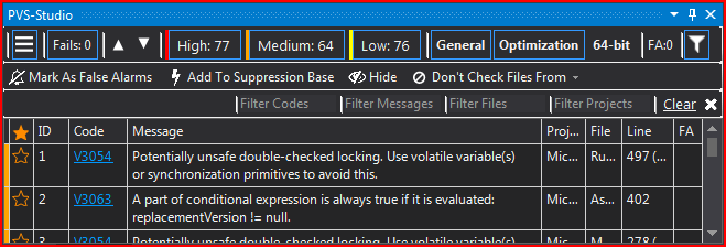
Figure 6 - Correct display of icons in our window for the dark scheme of Visual Studio.
Another problem that we encountered when changing the icons was their blurring at DPI other than 100%. This happened because all the icons were the size of 16 x 16 pixels. We managed to partially deal with this issue, using icons of 64x64. In this case, VisualStudio compressed them automatically to the needed size. But even with this option not everything was so great. Now with 100% DPI there was a slight blur. As a result, we decided to use the image size 64 x 64 because the DPI other than 100% it gave the most satisfactory result, while having 100% of DPI, the blur was practically unnoticeable.
Also, when setting the DPI as 115% we noticed clipping of the right side of the icon by several pixels. Our attempts of adding several pixels on the right programmatically (so that the image has 64x68 pixels) weren't also very successful. The icons in Visual Studio were shrinking back to a square proportion, and although we managed to deal with the cropping of the image, the blur became significantly more evident. In the end, we just added a few empty pixels to each icon, leaving the size of 64x64. This decision produced minimal blurring (practically imperceptible to the eye) and removed the cropping of the right side of the icons.
Despite the seemingly significant external changes to PVS-Studio user interface, the internals actually remained the same. We hope that the new interface will remain "familiar" for our old users, and for the new users it will be more intuitive and clear. And, of course, it would be "nicer" in the eyes of all of our users. It's up to you to judge whether these changes were a success or not.
0
0
0
0