PVS-Studio has a mascot that became inseparable from the brand - a unicorn. Lately we've been getting many questions about our magic steed: why the unicorn, why has he changed so much, does he have hooves, how come he doesn't wear pants, and how do we draw him. The answers are finally here, in this very article.
Attention: there will be a lot of pictures. And I mean A LOT.
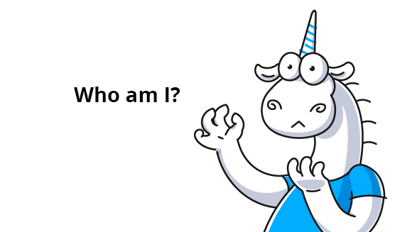
I usually left those questions about the mascot unanswered. I tend to think that how people see a product is more important than how this product is created. This is why we always rely on our clients' perception and imagination. However, many people do like to dig deeper and learn about production, easter eggs, curious facts, and background stories. So finally, I got up the courage (and time!) to detail all the development nuances - how our illustrations are born, what tasks our wonderful mascot accomplishes, and what ideas he carries.
PVS-Studio got a mascot by accident. It was back in 2011. One of the company's founders, @Andrey2008, wrote a note where he shared fragments of poorly written code from well-known projects. To illustrate his point, as a joke, he added an unambiguous picture. It was freely available on the Internet and did a great job at showing what a developer might feel when seeing poor-quality code. Andrey's articles had always attracted a lot of comments. This time, however, some of them were dedicated to the opening illustration: 'habr' users applauded the picture and posted their own unicorns that vomited a rainbow.
Bullseye! The image clearly conveyed the message. They loved the unicorn. So, we tinkered with the idea a little bit and went on adding the vomiting steed to our new articles. Now the images were drawn to order and depicted the unicorn in a variety of new ways.
With time, we started to place the unicorn in new surroundings and the mascot learned how to mimic popular memes. Our unicorn appeared next to the computer more and more often. He now wore a blue shirt - which was much less funereal - and became our full-fledged logo. The company reached a clear understanding of what he should look like and what idea he should convey to us and our subscribers.
When I came to work at PVS-Studio, the unicorn was already an integral part of the company's marketing strategy. Many developers grew fond of him. Clients loved the merch 😊. And it made total sense, because such a mascot had undeniable advantages, for example:
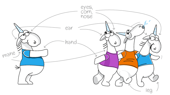
But the world keeps turning - we designed more and more illustrations, and finally time came for our unicorn evolve again.
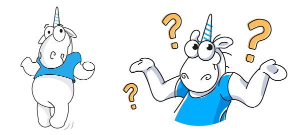
Before/after
All these changes were intended to make the mascot more human-like, emotional, and appealing on the market. Why is this so important? First of all, the illustration's theme and message became crystal clear. Facial expressions, body language, actions, and moods were easier to read.
And what do you think? Did we succeed? Please do share your opinion in the comments, we'd love to hear from you =)
That's where I could end this section, but there is one more change I want to talk about. Our unicorn does not vomit anymore. Even when the code he sees is atrocious. Okay, sometimes he does feel an urge, but those are rare references to the past. As the company and its corporate culture evolved, we abandoned this harsh and provocative image. This is a logical decision and stage that many companies reach eventually. Let's take, for example, the well-known story about the Starbucks logo: first the wonderful Siren covered her breasts with her hair, and then the picture was zoomed in to hide her bifurcated tail.

Okay, we are done with the unicorn's development history. This means it's time to finally dissect him and find out how he is different from ungulates and why we take all this so seriously. Here I'll also say a few words about PVS-Studio because the unicorn is a part of the product and one cannot explain the mascot as an entity separate from PVS-Studio.
PVS-Studio is an application designed to better developers' lives. Writing code involves checking it for bugs regularly. PVS-Studio helps automate a significant portion of these checks. The tool looks for bugs in code so that the developer can spend more time on new exciting ideas and tasks.
And we get it, all of it! We are a team that consists mainly of developers. So we feel for our customers when they struggle with bugs. We understand developers' problems, lives, interests, and humor. Our unicorn encompasses and represents this IT environment we all know so well.
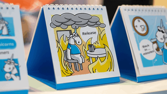
Below are some facts about our unicorn. You can see them in our illustrations, in one way or the other:
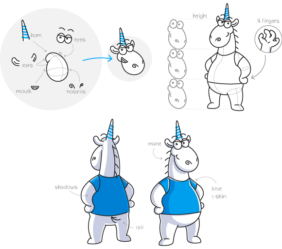
And that's not all! In illustrations, everything matters - corporate colors, line plasticity, contour shape. I'll tell you more about them in my next article. There I'll take you through the entire process: from creating an illustration to animating it. I think this information can help designers who develop mascots/stickers for themselves or to order.
As for our unicorn, all I have to add is, he loves his job, he's smart and a little geeky - and knows all about deadlines and fuckups. He works hard to write beautiful high-quality code, fix all bugs, and prevent them from getting into the release version. This all is true about us - and about each and every one of our clients. That's what our unicorn does - he shows that our team and your team walk the same earth and fight the same battles. Shows that we are alike and we care.
0