Viva64.com - the main PVS-Studio developers site, turned 10 this year! The domain was registered on Nov. 9, 2006, and the latest major design update was done in December 2010. It's time for a change!

At the moment, 4 people are involved in the development of viva64.com:
Other people contribute to the content of the website, but are not related to the infrastructure of the site, its design, or functionality.
We develop our own software product - PVS-Studio, a code analysis tool for developers. It helps to find bugs in programs by doing analysis of the source code. The client companies save money by detecting the bugs before beta-testing of the product, and of course, before the release. This is the product we sell.
To spread the word about our analyzer, we write articles about the inspections we have done on open source projects, where we find bugs with our analyzer.
For a long time we couldn't figure out, what category our site fell into.
On the one hand, we are a company, and therefore, this is a corporate site. But we're neither Disney, nor Microsoft, so nobody really cares about our company.
On the other hand, we have a product for programmers, but in the era of the AppStore, Play Market, and other stores, the site of a separate tool isn't that interesting to end-users. A lot of successful products live happily without a website.
Finally, on the other hand, we have a content site. After all, the main aim of people who visit our web site, is to read articles about the checks done on projects using our analyzer, to see which bugs we managed to find, and learn how to write bug-free code. It turns out that it is something of a learning resource.
Having combined all of these options, we have come to the following conclusion. We have a content site; but every page should make it clear what PVS-Studio is.
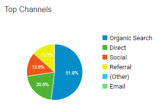
We have come to the conclusion that we have a content project. What idea do we want to convey to those who happen to visit our website? First, we should understand how visitors land on our site, and which pages are the most popular. Let's turn to Google Analytics. Here is the overview of traffic for 10 months of the year 2016 (Acquisition Overview for Jan-Oct 2016):

If have a look at the most popular pages, the main page will only be in 15th place. Thus, we can conclude that people almost never go to the main page, but go to some content (articles) posted on the blog, either from a search, or from social networks, or via a link from a different resource.
Therefore, here is the first important conclusion: our visitors get right to the "middle" of the site, bypassing the main page, which means that the idea to "lead" the person from a main page to purchasing the product won't work.
Ok, we sorted that out. But how can we "direct" the person to the product purchase? After all, all the articles are written with this goal in mind.
We see that our sales cycle is about 3-6 months. This is usually the time in which people read 3-4 articles about PVS-Studio, and test the tool on their project. Further on, if we are lucky enough, and the person likes the product, then they purchase it.
Thus, our task is to convey two ideas to the visitor:
One more thing - we should show that there are more articles on the site, so that the person reads 3-4 more. That's why we have a 'Recent articles' block, which should always be visible.
I am convinced that we do a great job - we find bugs in open source projects, and this makes a person believe in the tool. The aim of the website is to let the person know about the checks. That's why we have the block 'the number of projects we checked, and the number of bugs'. In this section, the user will see the full list of projects that we have ever inspected, and all the errors we found.
On any page of the site, the visitor should be aware that there is such a software product as PVS-Studio, and that it can be gotten on this website. So, the product is mentioned in various parts of the site.
We have decided that the purpose of the site is to inform visitors that the site is full of interesting articles about the project inspections that were done with the help of PVS-Studio, a tool that is objectively worth trying out.
How exactly do we convey this thought? Let's look at the main points.
The header states the company business: "We develop a static code analyzer". From my experience, quite often, even if a lot of money is invested in site development, the site will not necessarily reflect the company business. It can still work when these are corporations like Siemens or Samsung, with multiple business spheres. But it tends to happen, that small companies of 10-20 focus so much on wanting to be creative, trying to make the site really bright and shiny, but failing to depict the company business direction.
Our contacts can be seen as an e-mail, and a feedback form. It shouldn't be any trouble to write to us. That's why we offer two ways to contact us, and we want them to always be available for site visitors.
The left menu of the site is quite minimalistic. It has only the most important points. The most things important on our site? In our opinion:
The footer is quite simple:
In the right block we have the following traditional elements:
A couple of non-traditional elements:
The purpose of the right block is that the visitor, reading the articles, would realize that there are many other interesting materials.
As with all products which have a history, PVS-Studio has fans (and haters, but I have nothing to say about them here). For this category of people we created a section with a free souvenir section.

There you can find wallpapers for your desktop, and pictures to print on T-shirts and cups. It's quite amusing to see these things in someone's office.
This article about the development of a new version of the site would be incomplete without an interview with the project participants. I asked them to answer a couple of questions:
ER: Sergey, tell me please, was it easy to come up with the concept of the site? We are neither a store, nor a landing, and not just a blog. How did you understand the main direction of our activity?
SH: Yes, the project turned out to be bigger and more complex than it was at first glance. The main difficulty was to not make the site too promotional, but still to keep in mind that the main aim is to sell the tool. Our target audience is rather special, very skeptical, and cannot tolerate us begging them to buy. That's why we created inside the company a so called 'focus group', and discussed with them some elements and blocks of the site.
Firstly, we put the post block at the forefront of viva64.com, as it is first and foremost a learning and informational resource. This is why we focused on the readability of the articles and convenience for users. The analyzer itself moved to the "back" of the site, to one of the subsections.
We don't use marketing elements such as colorful banners, large and beautiful illustrations, or sparkling headlines, because developers aren't really impressed by these. These "cool features" can tend only to have the opposite effect.
However, we don't forget about the product, gently mentioning it for example in the block "Checked projects". There we tell how PVS-Studio has found serious bugs in the code of large and famous tools, and give examples. On top of this we demonstrate quite the impressive statistics of the checked open source projects and found errors.
ER: What way did you choose to encourage users to return to the site?
SH: In general, there is quite a number of them in the world, but very few will work for our target audience. For example, we do not use e-mail subscription, because our users aren't really big fans of such mail outs, to say the least, and social nets. Our choice were those channels where we already have subscribers - the Twitter page of Andrey Karpov, and RSS [RU].
ER: How much was the creative process subjected to censorship?
SH: First, I tried experimenting with the graphics; for example, with the concept of an imaginary world, like in 'Adventure Time', for our unicorn mascot. But the team rejected this idea, because the focus shifted to our main character. After several months of living with the product, you start understanding it better; its principles, philosophy, and closer to the end of the work I was completely on the same page as the team.
ER: How many pages did you have to render? Is this number typical for a website design?
SH: More than 60 layouts; we designed a tablet and a mobile version of every page. Such an approach is typical of online services, but is not often used for corporate and informational sites.
ER: How was this project different from other projects?
SH: It was the first order of a brand book for a website with exact guidelines and rules concerning the fonts, colors, intervals, elements and blocks. It was like a revelation, it turned out to be a handy tool for developers and for myself, the document significantly speeded up and the simplified process.
ER: Constantine, the first question is about deadlines. What were your initial estimations of the target date, and how did it turn out? What do you think - why is there such a huge difference?
CP: In the beginning, I thought this website to be just a simple site, with articles. So, I set the deadline of creating a website with a more modern design, of three weeks. I cannot comment on the outcome, as some say "once you release the site, your work finally begins".
ER: Well, I am quite aware about the time it took us to make this project. We started working on the design in the middle of May 2016, and finished (so to say) in the middle of November, so roughly half a year later. The first work on the site code started in July. One may say that it has nothing to do with the design, but it's important to understand that this site is more just 'a site with some articles'. We started working directly on the new design, and the code, only in mid-September, while the release happened in the middle of December. I.e., three months to explore the code and three more to do the main work.
Well, almost three weeks... (Sarcasm)
CP: I could never imagine that such a small site could have so much inside. It was good and bad at the same time. The good thing was a cool mechanism to publish articles on the web-site. The articles are written in Word, then with the help of a custom plugin, they are converted into .htmls, which can be published on the main site and on other resources. In addition, there were integrations with the PVS-Studio application, and a bunch of marketing analytics.
The bad side of it was the 'production-code'. I like to say to my programmers, "It is not production, there is no place for kludges". But after comparing pros and cons, spending two weeks of trying to put all our eggs in one basket, and also a considerable amount of time to polish the legacy-code, I came to the conclusion about the evolutionary approach. Apparently, the method just 'rewrite' everything doesn't work for such projects anymore.
Another difficulty was the new design. I am used to working structurally; using grids, and thinking about the point of the site, not about the emotional image of the site (without drawing well). I see a lot of flaws, but, "An ideal product costs endless money, endless time, and just doesn't exist". So we had to make compromises.
ER: By the way, what is the size of the site now? The size of the content and the source code?
CP: At the moment of writing this text, we have this:
In total, approx. 1350 pages in English and Russian. Besides that, there are 255 pages (where do these programming pages some from?) with examples of errors.
In short, there are about 1,500 articles in Russian and English.
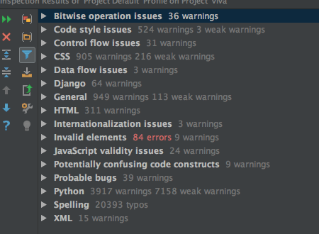
Speaking about the code, there are 14 megabytes of code, not including libraries, but this is a slightly artificial figure. For fans of static analysis, here is a more artificial number in the picture.

ER: Tell me about the 'guts' of the site? Which technologies were used?
CP: This site has a long history, it was made more than 10 years ago and developed by different programmers. So, the code leaves much to be desired - to say at least. Being a responsible person, I decided to use the minimum of non-standard and rare technologies, so that it won't be difficult to find a new developer, in case I get hit by a plane. The site is written on standard Python 2.7, and Django 1.9. If I were to start a project from scratch, I would use more modern technologies, and perhaps even implement them during refactoring. But this honor was given to another person 10 years ago.
ER: Is there anything you can say about the peculiarities of the layout?
CP: I tried to use mostly the 'universal' layout, and cut off the ready-made layout in the BEM-style (when each element is developed separately). This approach is good for unmanaged projects with hundreds of developers and hot changes. But I support the idea that CSS is a cascading style table, and I tried working in this paradigm. Also, I tried to use the abilities of the framework (imposition framework) to develop various elements without getting into CSS. Too bad, it's always a compromise. And I am not sure that my decision is the best. For example, I would like to remake the layout using SASS, and make it more flexible. When I started working, a lot of compositional problems weren't solved, which emerged during the development. Besides that, I haven't realized all the designing ideas of Sergey, but I tried to do the best I could.
A website is software, but as the HP director once said (as far as I remember, it was him), "If you want to make great software, start making your own hardware". There are numerous devices and solution, and I tried to find a compromise.
ER: How was the development process organized? Branches, various servers, and things like that? More details, please!
CP: Here is the infrastructure we have now:
We implemented automation and synchronization between different servers on the programming level. Looks like it worked. You can update the version of the site 'by air', directly from the administration system. Besides that there is a separate server on Jenkins that automatically converts the .docx-articles into .html, and uploads them to the site.
ER: Did you have to remake a lot? If yes, then why?
CP: I have a lot of respect for efficiency. I really cannot understand people who stare at the monitor for several hours waiting for the work day to be over, or for the boss to nag them. This site set an architectural challenge that I faced only once in my life, and I cannot say that I fully solved it. I finished at a Physics University, so I have the ideology of a scientist-engineer-researcher. I created about 5 versions of the engine, with various technologies and architectures, but realized it would be too risky to change everything at once. I remember when I was developing an IP-telephony for Tajikistan. At that time, they could get the electricity by voucher, not speaking about the internet. I faced a problem that they needed G729 codec (not open-source 723). The license for it was only in Intel, and a couple more. But the point is that wanting to save 5% of the traffic, I almost had a nervous breakdown.
There was just nobody around to stop me in this perfectionism.
ER: Now, post factum, how much time could it take to make the new design for the website? What about the new site engine?
CP: Three weeks could be enough. On the condition that I don't have to integrate with the current infrastructure, I will do the design using ready-made components, and editing through the administrative panel. What? It's just a site with articles! I hope you realized that this is sarcasm.
ER: What are the further steps?
CP: As a minimum, we should do the following:
ER: Ilya, can you tell the story of how you became a part of our team?
IT: The main site was disabled as if it were sending spam, and blacklisted for 'spreading viruses'. We needed to quickly sort out what was going on. And that's something that I like doing. In my youth I was in a hacker team, so I still had some skills. However, it turned out that there were no malicious wreckers, it was just badly set up protection against the simplest viruses, stealing passwords from FTP. The office was well-secured, but the home PCs, where there is also some official information stored, was not that safe. But it would be unfair to rebuke a common software firm, when even the US presidential candidates stepped on the same rakes. I think that the situation got much better - we got rid of dangerous protocols, cut the rights, talked with the employees, etc.
ER: Ok, now please tell about the hardware that the site works on.
IT: This site does not require any extraordinary computing power, just stable working conditions. We use a virtual dedicated server, which provides a good reserve. In case something goes wrong (extreme attendance growth, DDoS-attacks) - we are to migrate to a more powerful server in the shortest time or to organize a cluster, and connect external protection services to ensure the smooth operation of the site.
ER: Which tasks concerning the server organization were solved, and what should be done in the future?
IT: We are gradually decreasing the vulnerability of the system from external threats, and the speed of recovery in case of a crash. We moved to more secure exchange protocols, put things in order with the user roles and access rights. Now the backup is done to the cloud service with triple reservation.
Now, in the final stages is the organization of repositories, for the users of the Linux version of PVS-Studio, making our product easy to use and update. We would also like to embed the regulations for information security, and work with the backups. A triple backup is great, but it also needs to be monitored.
Besides that, we should create a script for automatic deployment of a complete system from an image on any server (so that it is done in a few minutes, not in dozens of minutes).
ER: Ok, I already want it all!
We have done a great job with the website, but we cannot say that the work is over. This why we will be very glad to get your comments, and suggestions about improvements to the site, and any feedback about the site viva64.com.
0