
Our website uses cookies to enhance your browsing experience.

This post will be first of all of utmost interest to project and technical managers whose teams use the PVS-Studio code analyzer in their projects. We have recently implemented a new feature to let you monitor the efficiency of the team tool use. You can finally have the necessary figures to prove to your boss that the analyzer which cost your team or company a few thousands of dollars is bringing a real, tangible profit. But don't worry – this article is not about ROI at all.
So what's the problem with static analysis tools besides them being pretty costly? Not every team that has purchased an analyzer can boast of really using it. And as for us, we are more than anyone else interested in our analyzer being used as efficiently as possible. We won't be satisfied if a customer just pays for a license and forgets all about the tool. You see, more than half of our customers renew their licenses for another year. So we need to prove to those who consider renewing their licenses that the tool really benefits their project.
That's why, starting with PVS-Studio 5.27, our tool can draw charts of the number of bugs detected in your project. The idea behind this feature is very simple:
Before studying any particular types of charts, let me first say a few words about the mechanism behind this new feature.
Every time you analyze your project in full (the Check Solution command), the analyzer creates a small XML file with the information about the number of messages in the %AppData%\Roaming\PVS-Studio\Statistics folder. In PVS-Studio menu, you will find the Analysis Statistics command to open the statistics viewing settings dialog. In this dialog, you can select the desired time interval, rule sets, and message severity levels. After that, click on the "Show in Excel" button to open Microsoft Excel installed on your computer and view the resulting chart.
There's no point speaking about this dialog in detail as everything is said in the documentation, so let's rather examine the examples of the possible chart types.
Here's the first example. Imagine your company has purchased PVS-Studio and set about integrating it into the project. Suppose we are interested in General Analysis errors of the 1-st and 2-nd severity levels only (for a start). After the first analysis, you've got about 1800 messages. Your programmers will first of all eliminate any apparent false positives – by suppressing them in macros, for example. Then they'll go on to fix the simplest bugs that don't take much time. Then the work will slow down a bit. That is why our chart looks like a curved line, not a straight one.
Errors are getting fewer and fewer until we get total 0 at some point. The chart type below corresponds to this bug fixing mode in PVS-Studio:
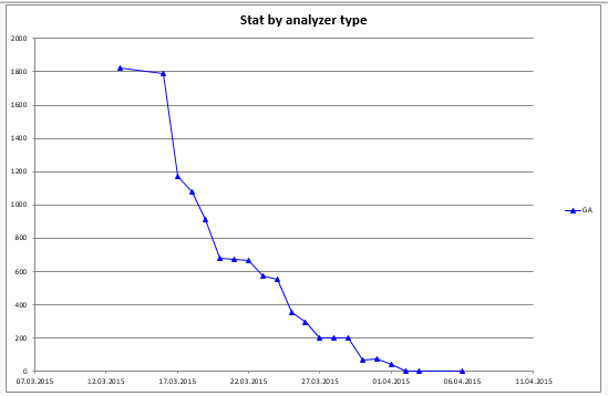
Figure 1 – Simple errors get fixed in the first place, then more complex ones, and the most complex bugs are fixed in the end.
OK, we've got all the messages gone at last and have 0 warnings in the last report. Can we relax now? No, you can't. Because if you do and turn off the analyzer (stop fixing new bugs), the number of errors will start growing all over again. Figure 2 shows what the chart looks like in this case.
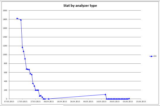
Figure 2 – Having fixed all the errors, developers relaxed and stopped fixing new analyzer messages.
Do you see the rise of the message number in this chart? It is because the developers stopped fixing bugs in new code after they had achieved 0 warnings for old code. Fortunately, the project manager noticed it in time and gave his team a talking-to, after which they eliminated all the bugs again and then kept their number at zero further on.
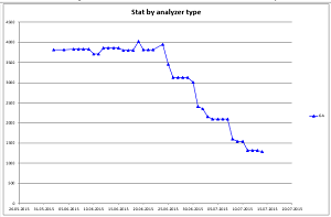
Well, what about the chart in Figure 3? What conclusions does it suggest?
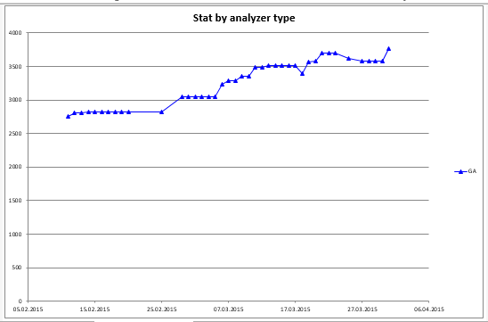
Figure 3 – An example of an ambiguous chart.
At first glance, you may think the team has given in to laziness and stopped fixing anything, which results in the bug number growth – and quite a fast one, from 2700 up to 3700. However, only a person completely unfamiliar with the project can think so. If you know what the developers actually do, then you'll get it right. You see, they have added big chunks of new code into the project (new project files in the general .sln file) lately. There's nothing to worry about in this chart. When the number of projects is settled, the amount of errors will stop growing that much if the team starts fixing them in time.
This chart is an example to warn you against "head-on" interpretation of statistics data. To draw correct conclusions, you also need to fully understand what your team is doing at any given time.
A perfect chart for evenly timed work would often resemble a staircase with steps as in Figure 4.

Figure 4 – A stepped chart.
A stepped chart like this is the best one, for it means that the bug fixing process is even and steady. Have you guessed what those "steps" mean, where the number of errors remains unchanged? They're weekends, of course.
OK, until now we were discussing examples when a team fixes every bug found by the analyzer. But we also have the "mass message suppression" feature in our tool whose purpose is to let developers ignore tons of messages generated on old code they are aware of but not willing to fix right now, and focus on new bugs only instead. What will the bug chart look like in this case? Well, take a look at Figure 5.
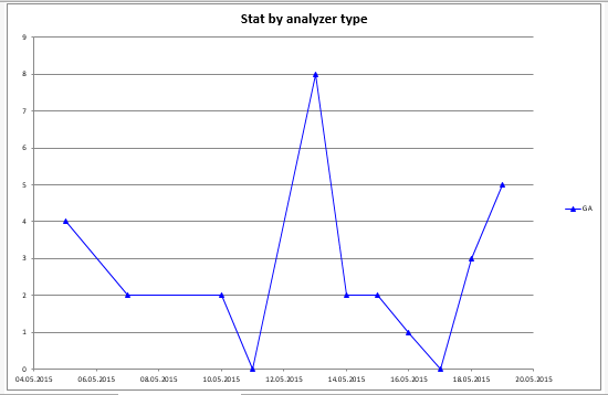
Figure 5 – A bug number chart for new code only.
Though it looks somewhat chaotic at first glance, it is exactly what a normal code analyzer driven workflow should look like. What do I mean? Look at the Y axis scale. The largest value reached by the chart is 8 – it is the maximum amount of errors (diagnostic triggerings) for one day. You think it's too much? But considering that we deal with a team of 50 developers and project of 9 million code lines, that's quite a nice result, don't you agree? But what I like most of all is that these bugs will get fixed not later than the next day.
Now we have figured out what both "incorrect" and "correct" charts look like. But how should you arrange the entire development process to achieve the "correct" bug chart? What should you do as a project or technical manager?
The following are the steps that will ensure the best result:
If the team succeeds in adopting this work scenario, the purchase and integration of the analyzer won't be in vain. And the question of renewing the license for another year will be easily resolved, too.
0
0
0

0